You wouldn’t want to end up as some Business Execs chew toy now, would you?
It’s that time of the month again. The time when you, dear single marketer, have to look at least 10 Excel files, as you manually click [Download], [Save as .csv] to pull, format, or maybe even screenshot the tables that represent the metrics of your latest marketing campaign, or even simply reporting on the website rankings. It looks like a mess, you’re feeling overwhelmed, and you’re frankly upset that there isn’t anyone to help you with this. Maybe a personal designer for the project?It would be nice if there were pictures to go with that report, listing all you’ve achieved in the month or quarter, you really want to show the board what are the fruits of your result, but how do you create a presentation and present in a way that doesn’t cause their eyes to glaze over in boredom?
Step 1: Start with the right presentation slides: Google Data Studio
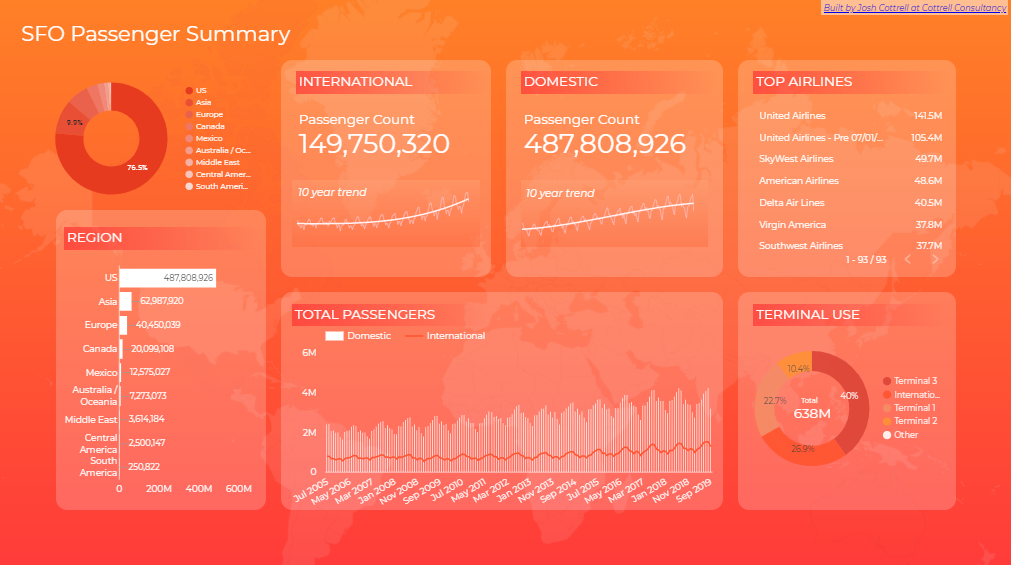
Stunning. Did they get a designer to do this? It looks incredible. But what if I told you that you too, could create all of this, make it interactive, so when your mouse hovers over a number or part of the chart, pop up boxes detailing numbers, or even links show up? Wow! It’s almost like it is an interactive web page on its own! That’s because dear marketers, it is.Google Data Studio is one of the most underrated programs in our tool kit, and it might just save our jobs one day. Sleek, customizable interfaces, and not to mention it can pull metrics directly from that excel sheet means no more manual creation of tables and charts. Need a bar chart intersected with a line chart to showcase the relationship between price and bookings made? Say no more Mr/Mrs. Marketer, Google Data Studio has just the thing for you. They even have simple guides to help you through. You just need an eye for design and adding some pretty background images that compliment the story you want to tell the board. Samantha Lile over at visme has some beautiful designs that you could take inspiration for, even if you’re not using their program.
Step 2: The pre-boardroom stakeholder meeting
You’ve made a gorgeous presentation using Google Data Studio, and now you need to talk to your team on how to present this, what are the key takeaways, and how to avoid getting an upset or obtuse board room member who will definitely ask about a certain metric.But that’s okay. In fact, that director who is always annoyed, has snarky questions, is probably the person you can count on the most in the boardroom, rather than the director who looks bored. If you take a look at the Plutchiks model of emotions, its clear that boredom leads to loathing, but annoyance can still be led to interest with skillfull presenters.The most important thing is to know your audience. Tailor your presentation to the stakeholder’s background or interest, and tell them a story that’s engaging and leaves them wanting more.
Step 3: The actual presentation. War in the boardroom
Time is money, as the adage goes. To really get the presentation started, have a hook (be it funny or curious), and lead with your strongest point. Remember all the pitches that went “Imagine if…” or “What if…”, followed up by the strongest pitch: “We can make it happen.” Or “It already exists, you just don’t know about it!” The Guardian has a good write up on it, or check out Dom Barnard at Virtual Speech for a more detailed breakdown for each story telling step.Once you’ve presented your executive summary and the points you really wanted to make, then it’s about justifying why you presented the earlier facts. This is where your gorgeous Google Data Studio presentation is going to really come into play, as you wow them away with the interactive-ness and design of the slide, but most importantly impressing them with your understanding of analytics.While the narrative is important, don’t forget to link the data and the finances to it. That’s why you went through all that effort to create a presentation based on your metrics like conversions, bounce rates, and the likes, right? We as marketers can no longer ignore the elephant in the room, that is using data to justify our marketing efforts.
Step 4: Make sure you’re looking to the future.
Managers, directors, CEOs, they could technically learn how to read what Google Analytics or Facebook Insights in a day. They don’t have the time for that, and generally want to hear a different, and possibly prediction from you and your team for the future of the company moving forward.
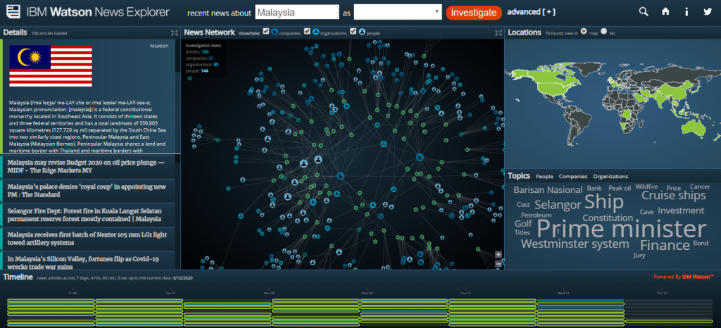
IBM Watson News Explorer in Malaysia. See anything familiar to you?
It might not be in your report under any one particular slide, but what are your competitors doing? How did it measure up against your campaigns? What are the current trends based on your keyword research? Your creativity in interpreting and understanding consumer behavior was the foundation upon all marketing, and being able to communicate that to the higher ups is vitally important for continued growth. Use programs such as IBM Watson News Explorer, or Google Search Console to find out what’s currently happening in your industry, at least enough to make a conversation and drive your presentation towards the future.
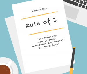
Remember the rule of 3 in marketing? Always repeat the copy, the voice over, the brand 3 times. One at the beginning, one at the middle, and one at the end. It’s reported the highest memory retention, because it’s a pattern, and we humans love patterns. You’ve got your hook and executive summary for the start, the middle to explain the concept in more detail, and finally you’re about to wrap up.“In conclusion” might be a tad too formal, but “To recap”, “Just so we’re on the same page here” all works as a natural closer for a presentation, and brings everyone on the same wavelength after the meeting’s finished.
In conclusion: Yes, this is a written article and I can use that phrase.
Step 1: Make beautiful data chartsStep 2: Make sure you and your team know whats the most important topic and how it relates to the most important person in the presentation.Step 3: Tell the story, but make sure to weave in the data, instead of letting it stand as a background image.Step 4: Predict the future within reason, and based on your understanding of the data.Step 5: Repeat things 3 times. One at the start, one at the middle, and one at the end. Three is the magic number!There are tons of free online resources, including this article that can simply tell you about it. But honestly, nothing is better for remembering lessons that are taught in person by an expert on the topic, since they are able to directly address your concerns. If you would like to further your Google Data Studio-fu (Doesn’t have quite the ring as Google-fu), as well as presentation techniques, come join us this April in Kuala Lumpur with a special session with Gemma Purnell, a certified Google Academy Partner! She knows the in and outs of how to get the most out of Google Analytics, as well as how to present it.